Style Your Stack Design: Barri Leiner Grant
Barri writes Permission Granted, her stack about grief. She offers writing workshops and support groups, and wonderful empowered ways of dealing with grief. And she's a treat!
Kudos from Barri Leiner Grant of Permission Granted
“I met Nan in a workshop and the Substack Writers @ Work Cohort offered by the inimitable Sarah Fay. I first enjoyed Nan’s vulnerable essays and then discovered her design and tech prowess under the hood. Sign me up! I suggested a font called Peignot that was used for my Bat Mitzvah invitation (I am a grief girl for as long as I am a font girl!). Peignot is also the font that was used for the opening and closing titles of The Mary Taylor Moore Show when I was a kid. I suggested we use it to create a new identity for the rebrand of my stack, Permission GRANTed. Her enthusiasm for my font choice, my illustration (by Jen Vallez), and a favorite hot pink/orange combo sealed the deal. I have had so many writers notice and comment, which fills me up. Grief does not have to be sad, and she agreed. If you are looking for a partner in design? Yes. Permission GRANTed.”
I met Barri Leiner Grant through our shared association with Sarah Fay of Substack Writers @ Work (Sarah’s a client, too!).
Between Sarah’s teaching about marketing my writer’s stack The Next Write Thing, and the joy I was experiencing playing in the Substack community, I got clear that I want to be here in Substackland 24/7 for work, play, and some amazing social interactions. To do that, I came up with my plan for creating StyleYourStack. I have a 13 year history as a web and graphic designer, and it this seemed like a great idea. I love working with writers especially. Sarah and I consulted about my game plan and gave me excellent feedback, and I began networking with my SW@W cohort, waiving an initial consultation fee to honor our connection.
Barri was one on my first clients. She jumped on board, and we got to work. Working with Barri was a fantastic experience. Besides being a grounded, generous human in the work she does as a grief coach, she’s also a multi-faceted talent. A marketing whiz, a person who can come up with effective taglines that pack a punch, in what feels like seconds––and sometimes is––I felt like I was working AND playing with a kindred spirit.
She is the self-proclaimed Chief Grief Officer™ of The Memory Circle and Permission Granted. Barri leads Write to Heal™ workshops, facilitates online and in-person support groups and provides tools to aid those in the grief process. She’s got a great sense of humor and exudes warmth and compassion. Her qualities go so well with doing this kind of healing work. She lost her beloved mom about 30 years ago, and what was a personal quest for grieving effectively and honestly became the world that she’s created for others who need the support of a community that understands loss and its aftermath.
When Barri and I first spoke she came ready with answers before I even got to ask the questions! She was clear about her likes and dislikes, which I discovered early in our conversation. I always ask new clients about themselves, and it’s usually a somewhat in-depth process. But with Barri, it was less of me probing and more of Barri informing and me listening! I adore her aesthetic. We share a love for big, bold fonts and bright happy colors. She ran her thoughts by me, and I jumped on almost every idea. So this collaboration was a real treat for me, and hopefully for her, too.
The Work
With all of the design specs chosen at the outset, I was ready to be let loose. We identified the perfect pink and the perfect orange. A little trial and error, but not a ton. I asked Barri to send me sample images of pinks she loved, and I started to play. I rendered several versions of my proposed wordmark (the name of the publication at the top of a stack that you see on the desktop version of your Substack site. The wordmark isn’t visible when using the Substack app, but it’s a very important feature, and if you’re anything like me, you might spend more time reading on your laptop or tablet than on your phone in the app. I’m not a fan of Substack’s default wordmarks. They are dull and don’t reflect the personalities of the writers of the newsletters. So…enter, Nan.
Drumroll for the wordmark:
AMAZING! We decided that because Barri wanted to have a play on words using her last name, we’d separate the word “Grant” by choosing a second color, the orange. I played with different combinations of the font…all cap, all lower case, capitals for the P and G, and we decided that the all lower case was the most pleasing visually AND Barri writes all lowercase, so really a no-brainer, but I wanted to make sure we covered our options. I also made another version that includes her name should she decide to switch it out. And who’s that little cutie hanging in between the “pg” and the “bg”? Yup! It’s Barri! But more about that sweet addition a little further down the page.
The welcome page. This is the first page a new subscriber comes to when exploring a stack. The place where first impressions are made. I asked Barri for photos and she sent me a bunch of beauties. Because she was so clear about her love for certain colors this was a breeze.
Here’s her welcome page:
The flowers. The flowers made it. The whole thing was cohesive and represented her personality so well. Love!
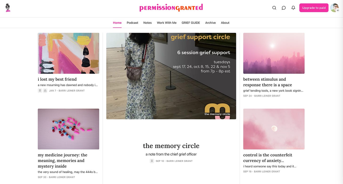
The Home Page
So you can see how someone with a great color sense (Barri) understands the coordination that needs to come into play when you want everything to flow and look great, consistently.
Lots of pinks in the photos, really makes a positive impact.
The Banner:
You see the banner at the top of any email you’ll receive from Barri or any other writer on Substack, if they’ve created one. I think they are crucial for brand familiarity. Integrating the wordmark, byline from welcome page and what’s that? That little cutie is popping in again. Guess she’s up next!
The “Logo” or icon:
Yes, yes. I do this every time I post about Substack’s version of a logo. I take issue with it, because it’s so small, and shows up in more than one spot, it’s important to know that doing a logo that’s super detailed won’t really work well for the different locations it will occupy. Barri had the answer looking right at her. This fabulous sketch by illustrator Jennifer Vallez, of Sophie and Lili. In the original sketch the stripes on the shirt were black, but I did a little Adobe magic and turned the stripes to pink. Perfect!

This element was so delightful and is simple enough to work as a logo, and icon, and a little profile picture. I’m in love with it. Absolute genius. I think Barri may be one, too. She’s definitely very special. So happy to have worked with her on this.
If you need some inspiration, some great graphics that pop, and more creative ideas about looking your best, get in touch with me!
Take some time, look around, and if you’re asking “What’s my next step?” maybe the thing to do is make an appointment to talk with me about styling your stack, or just go for it, and sign up for Style My Stack, and I’ll get you started!


This is so lovely, Nan! I absolutely love what you have helped Barri create. ❤️❤️❤️
Super! Yes, great work 👏