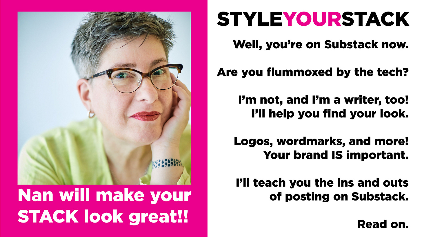
Style Your Stack Design: Sarah Fay
Yes, that Sarah Fay. You know her. A champion of marketing in Substackland.
Kudos from Sarah Fay:
“Nan has a keen eye for branding that pops yet is also elegant. The best of both worlds. I so enjoyed working with her on making my Substack my website (which has never been done before). She brought what I had in mind to fruition. Hire her!”
Wait. You’ve never heard of Sarah Fay? If you’re on Substack, and you don’t know who she is, then I have no idea who you’ve been reading or if you’re really on Substack at all!
So, what do you say when Sarah Fay asks you to design her wordmark, logo, welcome page, and a few other styling deeds, TIMES two? You say, “Oh my gosh, Sarah Fay, yes, please!” I always think of her as Sarah Fay, not as just plain old Sarah, because Sarah Fay is a brand unto herself, and her two names go together so well. There’s a rhythm that works. And there’s absolutely nothing plain or old about her. She decided to get rid of her traditional author website and relocate to Substackland completely. Everything Sarah Fay needs is on Substack now. It was an honor to assist her in making the move. It’s an option that many writers on the platform are exploring. It can be done and done well. Ask me how.
She’s a cutting-edge Substack coach who knows the ins and outs of optimizing a newsletter so that writers who work with her can learn to represent themselves clearly and get a better understanding of the value of their work, the way to attract readers, and more paid subscribers. She knows this Substack up and down, has the ears of the developers, and is on the frontline when it comes to advances in the efficacy of the platform. She’s a fabulous writer and a full-time cheerleader of the highest order. A college professor with an admirable string of creds, she’s the real deal. And she knows how to distill things and present them in a way that’s entertaining, warm, and fun!
She’s confident and smart as they come. With a photographic memory––I can’t begin to imagine what that must be like––and an incredible ability to multitask, this is a woman who gets shit done. I don’t think I’ve ever met anyone in my many years of life on the planet who works as much or as devotedly as Sarah Fay.
I first started appreciating SF’s work because I was her seeing her posts everywhere. I got curious as a newbie with goals that exceeded my experience. I needed help. And unlike previous iterations of me, I didn’t jump right in immediately. I read, I paid attention to her messages, I signed up as a free subscriber initially and then I observed for a while. And compared. There are a lot of people on Substack who are self-professed experts. There are the fast-food types, who claim to teach new Stackers how to succeed here overnight. Sorry. Unless you’re coming in with a list of thousands of subscribers (not me), it’s going to take more than overnight to make your mark here. And Sarah Fay is the first person who’ll tell you that. That’s a point of respect for me, and trust.
The next thing I did: I bought her book, Pathological. I wanted to know this person a little better. I wanted more of a sense of her before I made a financial investment in her offerings. It’s an extraordinary and beautifully constructed memoir, and an important contribution to the canon of books on mental health and recovery from mental illness. A hybrid memoir, she mixes her story of the six misdiagnoses that she received over the course of 25 years. She juxtaposes her experiences against a highly readable exposé of the inaccuracies and misrepresentations that the controversial DSM-V (Diagnostic and Statistical Manual of Mental Disorders) uses as criteria/labels for diagnosis and how it’s an inaccurate slanted tool for doctors and the insurance industry to earn their not-so-modest incomes. It’s about the labeling and required coding that must be used by practitioners so they get paid. It’s bold and brilliant, just like Sarah Fay.
The book resonated for me, as I’ve been through that system myself, and always had doubts about the agency I forfeited as a patient in that often-broken system. I was grateful to discover her work. It was affirming and passionate. It made me feel more confident about becoming her student.
Working with Sarah Fay as a student at Substack Writers @ Work has grown my readership quite a bit, and my income a little, but that’s more about my personal choices, having nothing to do with the marketing strategies she offers. Working with her helped me get more creative about building the type of home I want to inhabit in Substackland, and ultimately led to the development of StyleYourStack. It’s also widened my community here. I’ve got a wonderful assortment of new writer friends I’ve met through SW@W.
In addition to my participation in SW@W, I’m also her student in the first class she’s offering in separate project called The NEW MFA. It’s a unique writing workshop that teaches a lot of the subjects that traditional MFA programs tend to omit from their curricula.
If you need a hand when it comes to marketing and understanding the steps needed to grow your stack (apart from the visual branding, that’s my gig) Sarah Fay is a great way to go. Get on over there and check it out!
The Work:
When I work with clients, I need to know certain things about their aesthetic. Simple things like a favorite color, a font preference; serif or sans. I need great photos if they can be supplied. I talk to new clients to find out about them. I ask questions about their chosen stack titles. Sometimes that needs changing. What’s the focus? Are you hemming yourself in with something too specific? Can the name broaden a writer’s reach for readership and more options for subject matter? These are important questions. I love to brainstorm.
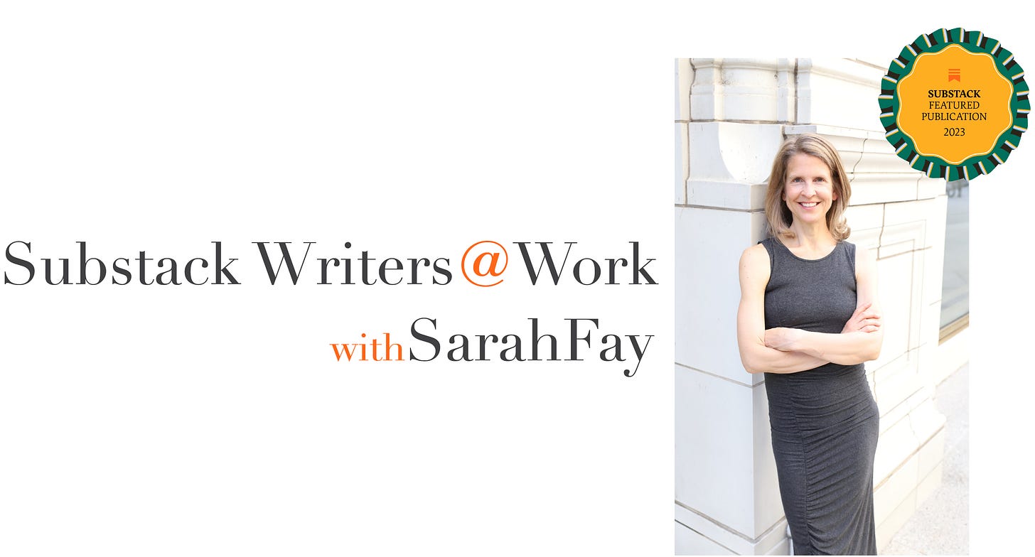
We’ll start with Substack Writers@Work. I designed a wordmark, a logo, and a cover page image for the welcome page.
Sarah Fay is elegant and willowy. I didn’t see her using a heavy sans serif font. There’s something old-fashioned about her. Classic. We ended up using Didot, a serif font with style. She’d been using orange as her accent color which we both agreed she should keep using to tie herself to the Substack’s orange brand color.
The wordmark came first. Elegant and willowy, just like Sarah Fay.
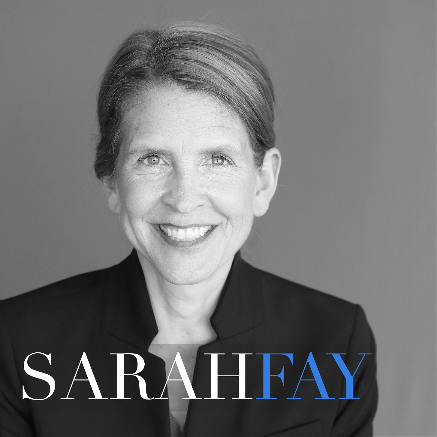
Then the logo/icon. I don’t call it a logo, it’s more of an icon, more on that later, or ask me about it. This will show up in the browser tab, and on the upper left corner of a web page and serves as the brand in the Substack app.
And finally, the cover image. We utilized her seal from Substack as a featured publication, and did you notice? No space between Sarah and Fay!
And then, we moved on to her author stack, and decided that Didot was still the way to go, a cross-brand of sorts, though Futura was in the running…
Sarah Fay’s author stack.
The wordmark. Again, Didot. Again, no space between Sarah and Fay!
The logo:
The cover image for the welcome page. The first place to make a good impression when new subscribers come to your stack:
It’s big, it’s bold, and she’s beautiful!
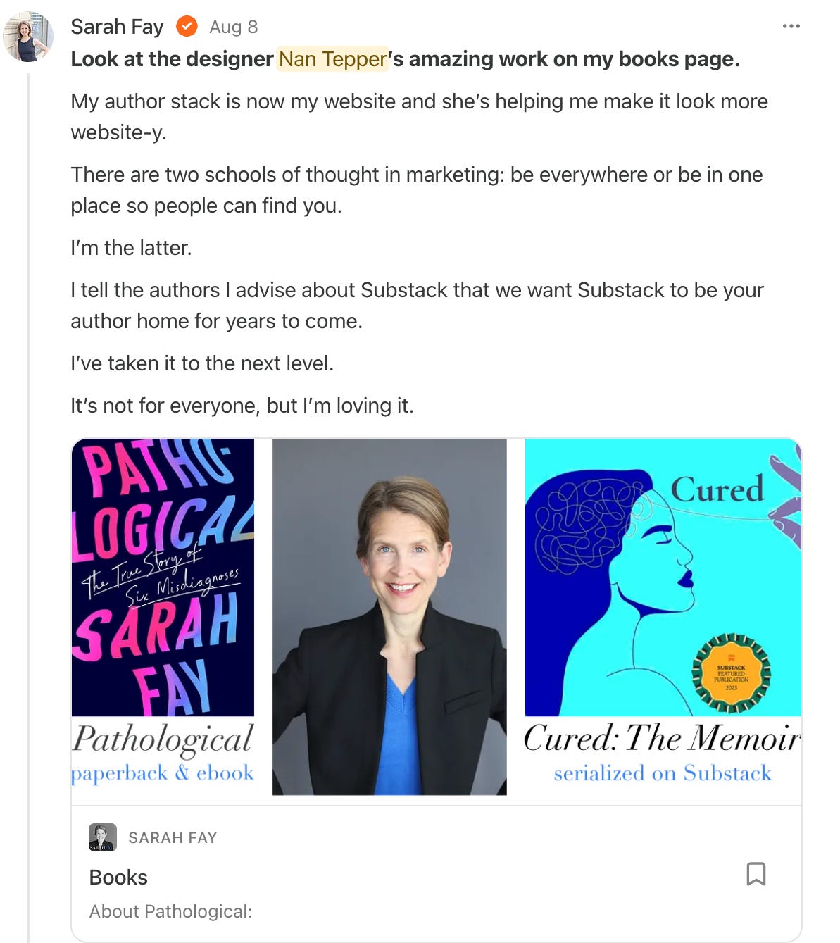
I did some other projects for Sarah for her author stack, I created a book page, and graphics for it, and a separate Selected Publications page, that has linked images with pub logos and takes the reader to some of her fabulous articles.
Oh, AND she has a second memoir, about recovering from mental illness called Cured: The Memoir. She’s serialized it on Substack and it’s available to read for the cost of one hard cover book. So worth the investment!
I’ll end here, but just know, if you’re looking for answers about growing your readership, and making a splash, and you’re looking for more than just branding, give Sarah Fay and Substack Writers@Work a good hard look. She’s the best.
And if you need some inspiration, some great graphics that pop, and more creative ideas about looking your best, get in touch with me!
Take some time, look around, and if you’re asking “What’s my next step?” maybe the thing to do is make an appointment to talk with me about styling your stack, or just go for it, and sign up for Style My Stack, and I’ll get you started!


This is so cool! I’m also in the process of turning my Substack into my author page and I’d love for it to feel more *web-sitey,* too. I’ve already moved my domain over. I may reach out! Great work 🤘🏽
Great design Nan! I love so much about this. Two colors. The pop of blue. Joining the names. And more and more - brilliant!