Style Your Stack Design: Paulette Bodeman
Paulette publishes Because Life is Messy...a stack for people who want to grow, embrace the messiness of their lives and uncover the gold within. Sounds good to me!
Kudos from Paulette Bodeman:
“I’ve been writing on Substack for almost one year. It’s my happy place. I’ve met several amazing writers and made new friends: Nan Tepper is one of those. Yeah, I know that sounds cliché, but it’s also the truth. I reached out to Nan because I was struggling to figure out how to change something technically on my publication. We hopped on a Zoom call and immediately connected. I shared my frustrations with Nan about the design and name of my stack and, voilá – magic. Well, magic to me because I’m technically challenged. Plus, not only is Nan a fabulous graphic designer she’s also a great listener. Nan took the time to get a sense of who I was and what my publication is about before making any suggestions. What I so appreciate is that Nan understood that for me redesigning my Substack was more than a name and design change – it’s an outward expression of how I try to do life: everything is spiritual practice and an opportunity for personal transformation, even a redesign. She got that immediately; thank you, Nan.”
I met Paulette in Sarah Fay’s Substack Writers @ Work Cohort. We were both there for similar reasons: to learn how to market ourselves on the Substack platform as writers, increase readership and the number of paid subscribers we have––if that was important to us––and identify who our audience is or what kind of reader we want to attract. In the cohort, Sarah gave us the tools to this, and we also explored what we can give to our readers to increase the value of our stacks.
Paulette is lovely, kind, calm, funny, and generous. She’s written a wonderful book, The Breakaway Girl: Secrets of a Tantric Yogi. She’s down-to-earth, earnest, and humble and she walks her talk, always looking inside for ways to grow and live a satisfying love-filled life.
As a tantric yogi, talented indie author, and wonderful life coach, she has much to offer, and can share wisdom on a broad scale through her writing, and help people hone in on their goals with one-on-one coaching sessions.
When I had my first conversation with Paulette, we talked about what she does, what she wants for her stack and her growth, and I asked a lot of questions about her chosen name for her newsletter. I asked because I had reservations about it. The former name of her stack was: Sage Sanctuary (Because Life is Messy). It felt limiting, as if she’d unintentionally came up with a name that would target a limited audience. The words I tuned in on were Sage and Sanctuary. For me the word “sage” brings up thoughts of wise elders, crones, and calls out to a select group of people who look for that type of connection. There’s nothing wrong with that––some of my best friends are crones, I may even be considered one, too, at this point in my life––but it seemed too specific for what Paulette wants to achieve. Sanctuary is a great word, but it reminded me of deep quiet, isolation, and a “sacredness” that wasn’t exactly in line with the message I think Paulette wants to convey. I wanted to help her broaden her reach. Appeal to a younger population of readers that might not be drawn to a stack name that started with “Sage Sanctuary.” But what did jump out for me is the second part. BECAUSE LIFE IS MESSY…
Yes, it is. And every single one of us knows that, I think. What we do with that knowledge is the point. Do we struggle when the mess appears? Do we calmly hold the mess, accept it and still get done what we must get done? Sometimes. And sometimes we need a little help. Paulette Bodeman of Because Life is Messy… to the rescue!
Paulette writes about our shared human experiences and how to “unearth the gold in the beautiful mess of our precious lives.” She encourages curiosity when the messiness of life shows itself. She lovingly extends a hand to her readers and helps them get to that deep well of inner wisdom that we all possess. Sometimes we get lost along the way. Paulette is the guide to help us find the path again. Her words empower her readers and her one-on-one coaching clients get back to the truth of their being, to ground themselves in the present so that they can embrace the messiness of life with bravery, not fear, with fresh eyes, and self-love.
I learned a lot from Paulette. Working with her was fun. We laughed a lot, at ourselves, at each other (in a loving way), at the messiness of life as the project took shape. We explored ideas together, and came up with a color palette, a wordmark, logo/icon and welcome page artwork. I was a little sad when the work was completed. I enjoyed her presence in my daily life. It’s so good to know I have a new, wonderful friend.
Check out Paulette. One of the sweetest women in the Stacks.
The Work
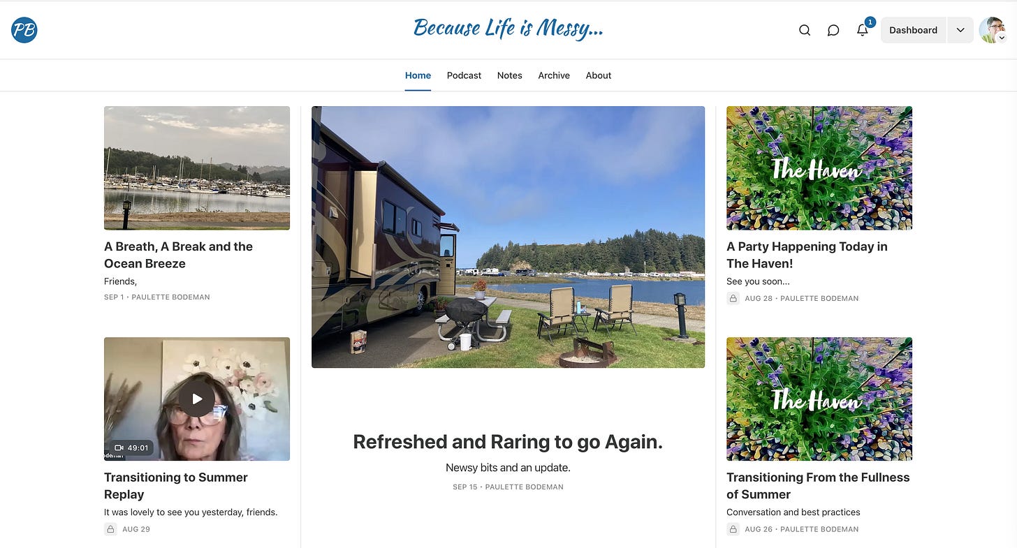
In discussing the name change, I knew the font had to change and reflect the new spotlight on acknowledging the mess! So I aimed for a font with movement, a slight shift to the right reminiscent of italics, but not. It brought up forward movement for me, that tilt. Paulette really helped with this, she knew what colors appealed to her and we stuck with blues, but I went deeper in tone, with a blue that had some green in it, and a richness not present in the original blue of her first wordmark. In her old wordmark, the phrase “Because Life is Messy” was contained within parentheses. In this version we pulled it out of its (side comment) energy, and brought it forward. We chose the ellipsis because who knows what comes next?
The wordmark:
The wordmark looks great at the top of her stack and there are lots of blues in her featured photos. I’m sure, because it’s a favorite color, she looks for it in the photos she chooses to accompany her posts.
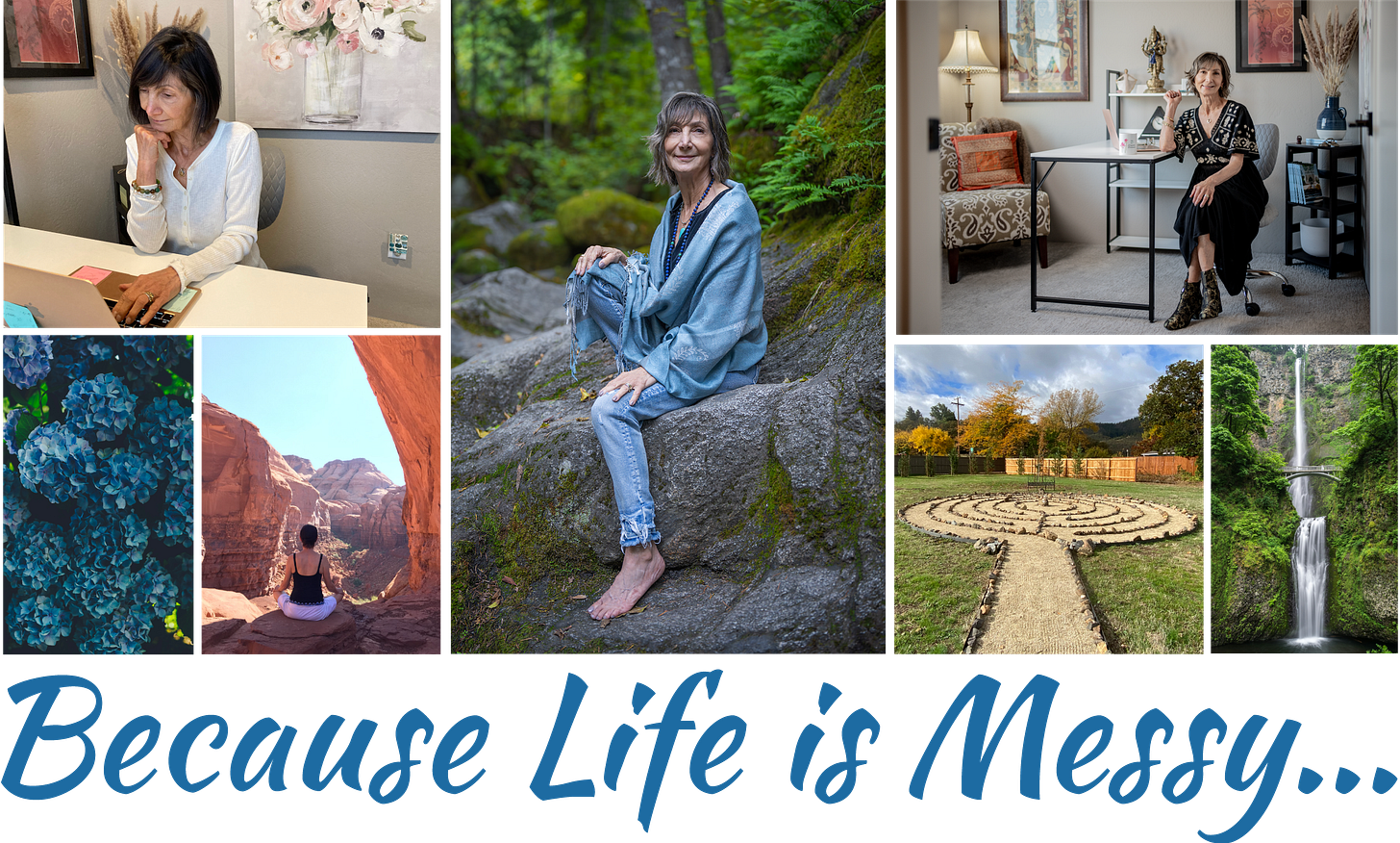
I’m finding that a lot of my clients are enjoying the idea of a photo grid/collage for their welcome page. It’s nice way to introduce oneself to a new subscriber.
It’s friendly and varied, and highlights Paulette’s connection to nature. She and her son, daughter-in-law, and husband built that labyrinth. I find that so impressive. Have you ever walked a labyrinth? I have. It’s a wondrous meditation.
The logo/icons:
I did three different ones for Paulette, so she could play with them if she wants to switch it up. I’ve said it in previous posts, and I’ll say it again until someone at Substack Central hears me. Logos and Icons are often different animals. Icons, or favicons (the little image in your browser tab) need to be simple, simple, simple. Logos should be simple too, but can be much more detailed than a favicon. I wish Substack would offer favicon and separate logo options instead of using this one image to cover more than one base.
And finally, a new banner for her emails that go out to all of her subscribers:
We set up new footer text as well.
I look forward to watching her stack grow.
Life IS messy and it sure is beautiful, too!
Take some time, look around, and if you’re asking “What’s my next step?” maybe the thing to do is make an appointment to talk with me about styling your stack, or just go for it, and sign up for Style My Stack, and I’ll get you started!


Your work is fantastic! I love the new look you created for Paulette. Well done.
I love the title and the look!