

Style Your Stack Design: Lyn Chamberlin
Schedule your first session and meet your Brand Therapist™


Kudos from Lyn Chamberlin of Brand Therapy™:
Nan branded the brander—and that’s no small feat. I came to her with existing brand assets, a strong voice, and a clear audience—but absolutely no idea how to translate any of it to Substack. Nan didn’t just make it work. She reimagined it. From the title to the logo, the favicon to a fresh color palette, she gave my newsletter a visual identity that felt both completely new and unmistakably mine. She knows how to fuse design with strategy in a way that actually builds audience. Nan didn’t just make things look good—her design brought in new subscribers from day one. Working with her was a revelation.
Living in Substackland can be a little blurry for me sometimes. Days blend one into another, and I sometimes have trouble remembering when I first crossed paths with the writers and other creatives I love on this platform.
Of course, this is my way of telling you I have no idea how Lyn and I bumped into each other here, but indeed, looking back, all I know is it was one of the happiest head-on collisions I’ve ever been involved in. That happens a lot for me in this mini-verse. Get to know the folks you run into on Substack. It’s not hard and the rewards are huge! There are a lot of sparkling people here.
Lyn and I share quite a few things in common. We’re in a similar field, and we each bring different gifts to our conversations with each other and with the clients we serve. Lyn’s experience has been more focused on working with non-profits and large institutions, like "the Ivies. The Ivies seem to be experiencing a whole helluva lot of pain, lately, thanks to an unfortunate series of events that took place in the US recently. You know what I’m talking about. And yes, I digressed from the ultimate purpose of this profile. But I can, because it’s my stack!
Even though Lyn’s past branding and marketing experience targeted corporate work more than working one-on-one with individual clients, I have no doubt that she’d help focus any person lucky enough to work with her on a branding strategy. Her mission is to help you discover your mission, and she does so with intelligence, sincere charm, and a great sense of humor. I love our Zoom visits. It’s hard for me to end those calls.
She’s a colleague through and through, and I love the way she works.
She started with a wonderful idea, marketing her business as The Brand Dame (a fabulous name and a play on Grand Dame.
But you have to pronounce it the right way.
BRAAAAHHHHNNND DAAAAHHHHMME. Lot’s of “Aaahhhh.” Well, you don’t have to pronounce it that way, no one else does, but I do, because it makes me giggle.
Silly is good.
Realizing that her audience here on Substack is made of individuals––the writers and other creatives who bring their talents to our lives––and not large organizations, she came to understand that she needed to shift her focus, and address the needs many solo clients have for branding consultations that are powerful and informative, without roping them into huge contracts and major expenditures. So, Lyn did a rebrand of her own. Now, she’s created a great idea to help people identify their unique brand in a smaller package, by utilizing Brand Therapy™ sessions. The sessions benefit her clients in a more direct way, quickly zeroing in on their path, their message, and their purpose. Lyn does that. She cuts to the chase, seeing clearly the things a client might miss. Self-examination in any situation can be challenging. But self-examination with the aid of an expert is much easier, more fun, very clarifying, and way less challenging than going it alone.
The Work:
Now, let’s get down to it. I ask a lot of questions of my clients––about who they are, their likes and dislikes, and I do check their party affiliation, as well––only kind of kidding––actually, not really kidding at all. Well, maybe I’m kidding. A little.
I always Zoom with my clients so I can see their clothing, environment, the books on their shelves, personal style, knick-knacks, you know, them. I want to see my new client and gain understanding of who they are.
In Lyn’s case, we both agreed that we didn’t need to reinvent the wheel too much, and decided in going forward, to borrow from her Brand Dame website for some of her already existing design assets. I used her font, the color palette, and the energy of the graphic design and riffed on the assets she already had to cross-brand the two sites.
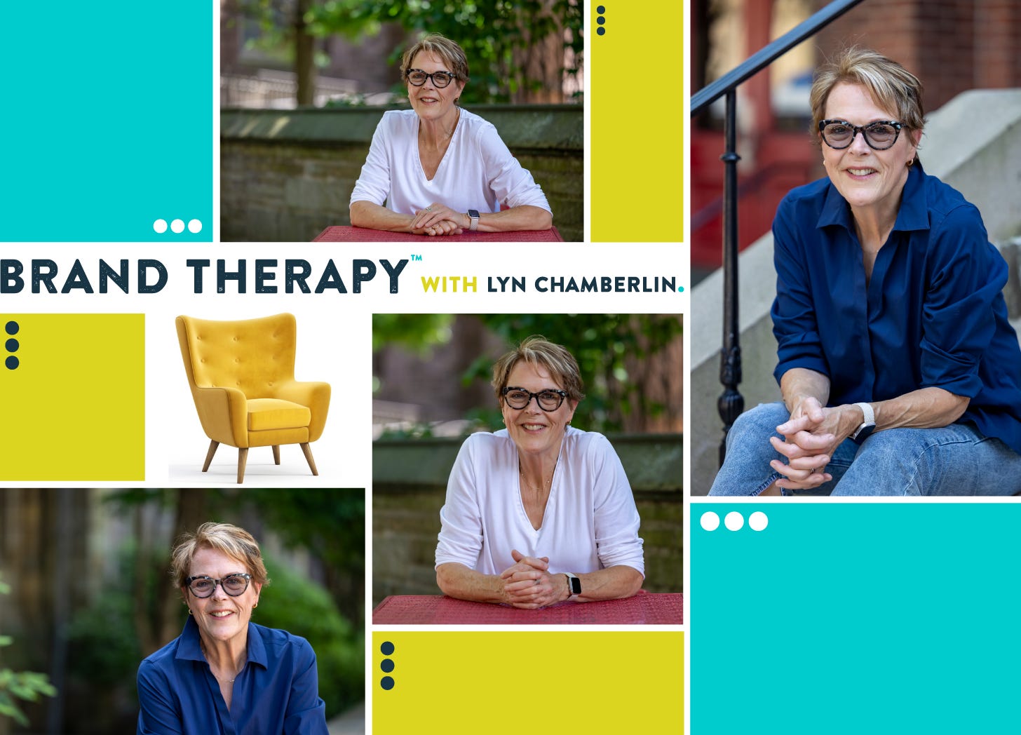
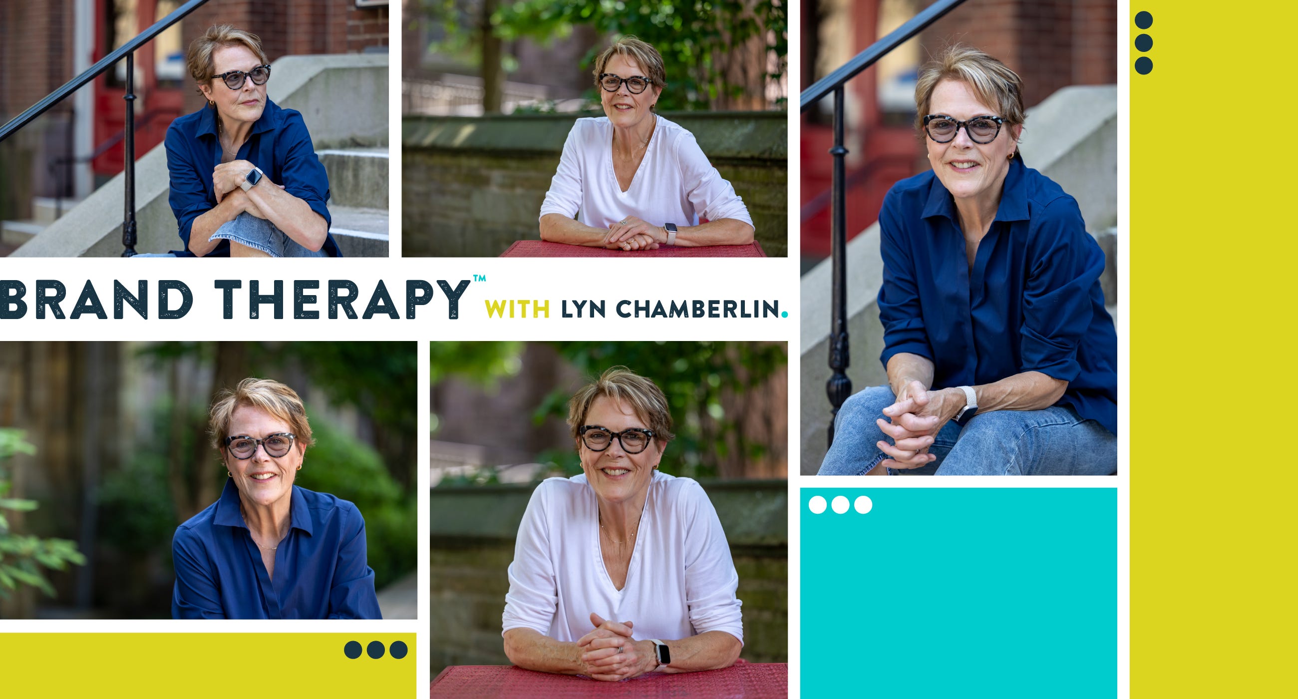
I went on to create the other visual assets for her stack. The wordmark was relatively simple, as we didn’t have to pore through hundreds of fonts, looking for just the right one. She already had it. I created a logo/icon, three variations of a photo collage for her About, Welcome, and Hero/Pinned post on her home page. I also made a spiffy little divider to replace Substack’s subtle (read as uninspired, boring) default one. If I can find an opportunity to insert a visual brand presence, I’m sure as hell going to do it!

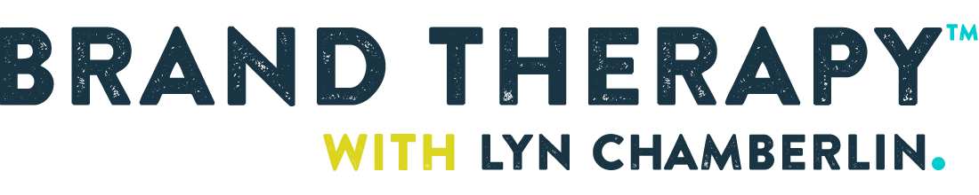
The Wordmark:
The wordmark is the header or title for the publication, and it’s found at the top of the site. It’s a great place to make an impression. I decided I didn’t just want it to bear the name of her stack, I wanted Lyn’s name front and center, too. I have a preference toward featuring the author’s name, making sure that the audience knows who they’re reading. And here’s a funny coincidence: the name of the font is, wait for it, Brandon. Brand-ON! I adore that so much, and I had nothing to do with it.
I love me some synchronicity.

Logo/Icon:
The logos I design for clients really are more like icons. Very simple, scaled down, as they reside in 3 different places on our stacks. You can find the “logo” in your browser tab (a tiny spot), and as the visual representation in the Substack app for the publication, and in the upper left corner of your publication website (also quite small). And, if you don’t create Welcome page art, the logo shows up here, too. In this instance I firmly believe less detail is more effective and I like icons that POP!
I like icons that are, ahem, iconic! Quick, colorful, simple, and memorable. Include too much detail and you could shoot yourself in the foot. So, since the point of having a Brand Therapist is to answer the question, “Who am I, anyway?” (uh, oh, strains of A Chorus Line, playing in my head…and now, yours. Sorry.) Naturally, the answer for the logo was a question, too.

The Divider:
It’s my practice, most of the time, to use the logo/icon I’ve designed to create the divider. A subtle, but not so subtle way of reminding the reader where they are. They’re reading Brand Therapy™. Or your stack, or mine. I made two. Lyn can use either one, but we both like the first one the best. I combined the colors and used the font that are part of Lyn’s style sheet for her already existing brand package.


Welcome page:
The welcome page is the page people come to on the website (not the app) when they’re not subscribers yet. I like welcome pages to be colorful and inviting. I want them to spark curiosity. I want them to be yummy. I want people to see them and get excited.
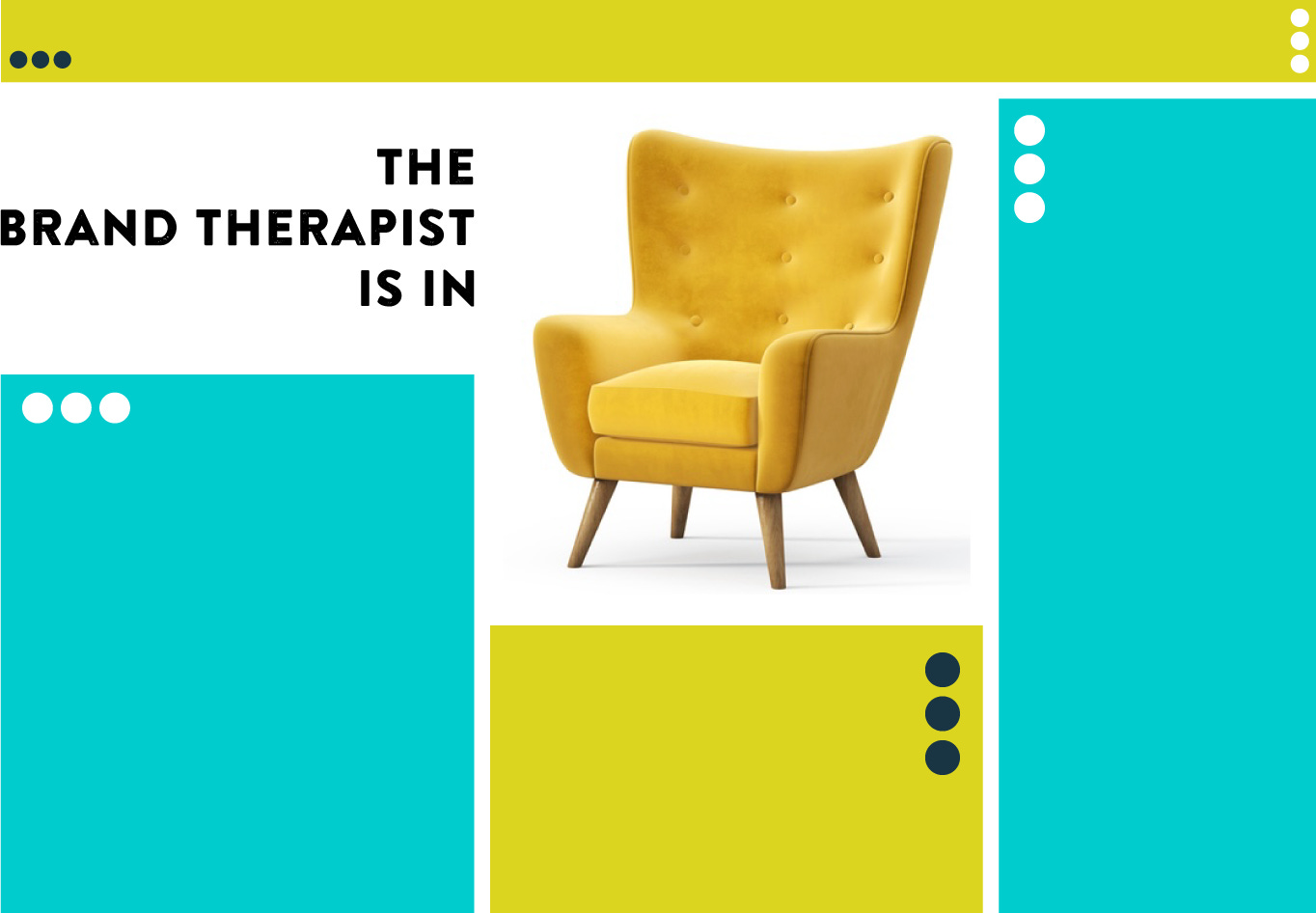
I did 3 collages in all. The one below is for the Hero post on Lyn’s Brand Therapy™ home page. Lyn found the chair image, and loved the therapy message it implied, so I centered the focus on the empty chair that a client/”patient” can sit on! Looks comfy, doesn’t it?
Email Banner:
Branded email banners are essential. Sending a post to a reader’s inbox without branding makes no sense. SO, every package I create includes a banner. Look like a pro.
One more thing:
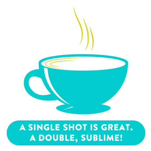
Then there’s that crazy “buy me a coffee” ask that a lot of us add to the end of our posts. It’s nice to get tips for our writing, what we offer others. This one needed a custom image, because Lyn doesn’t just drink coffee. She drinks espresso!
That’s the show for today! Now, pull out your appointment calendar and head on over to make your appointment for a Brand Therapy™ session with the one and only Brand Dame and superb brand therapist, Lyn Chamberlin.


If you need some inspiration, some great graphics that pop, and more creative ideas about looking your best on Substack, get in touch with me.
I love everything about this!!!! Phenomenal work, Nan!!